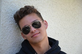
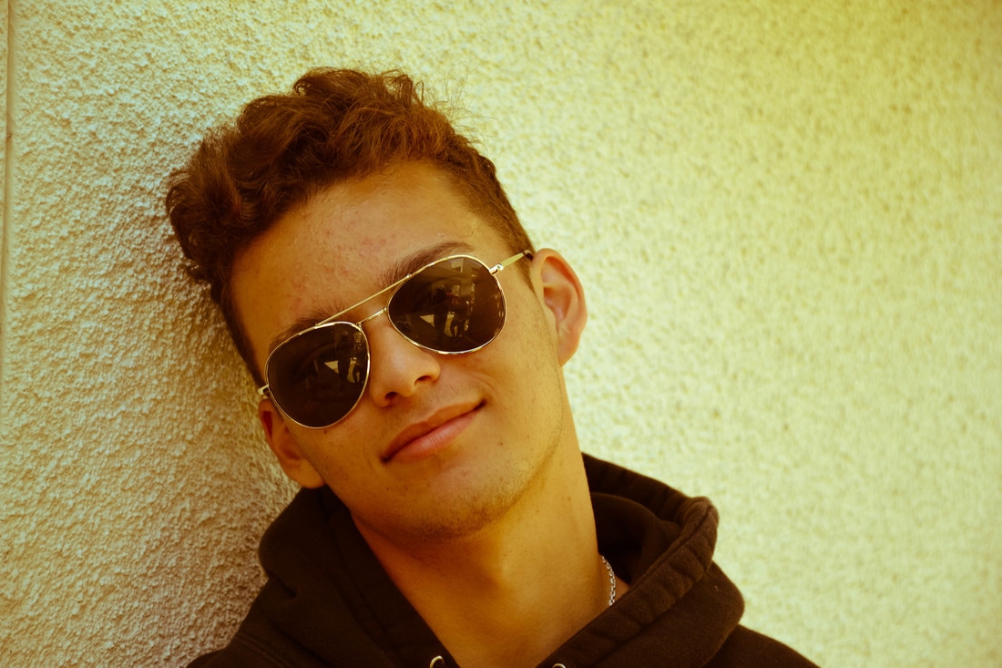
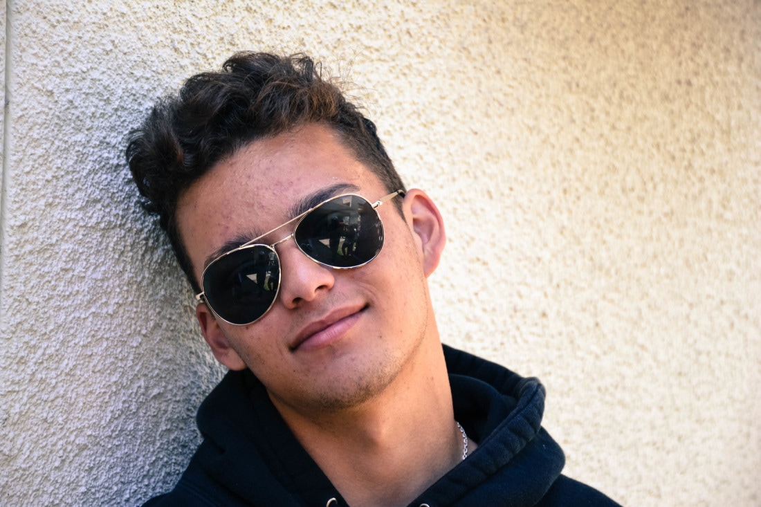
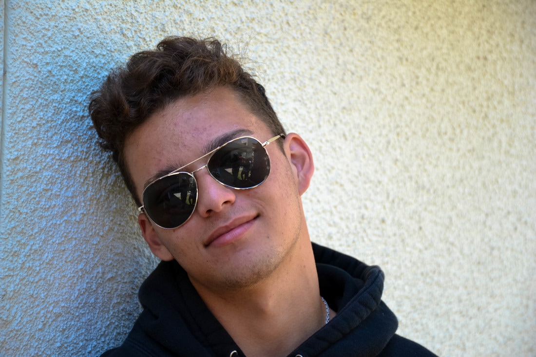
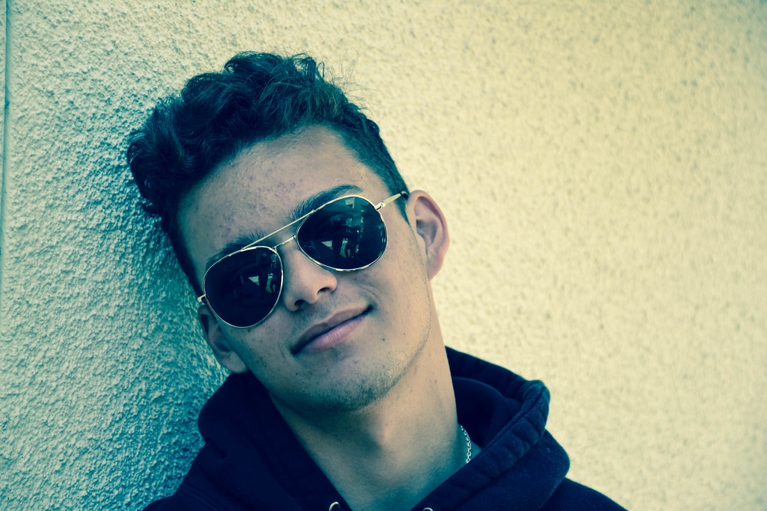
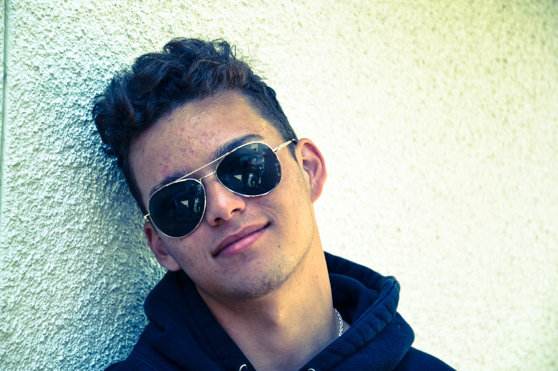
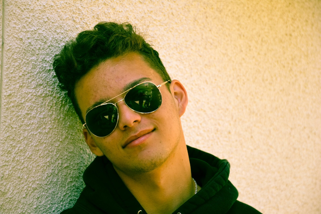
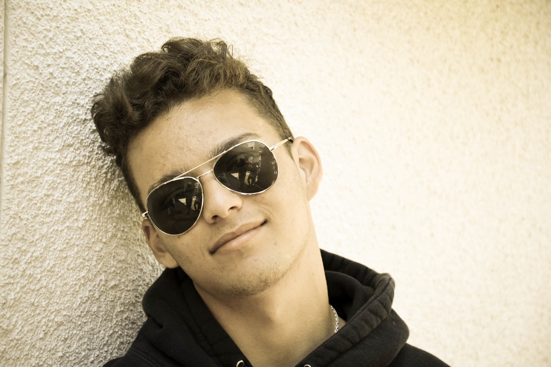
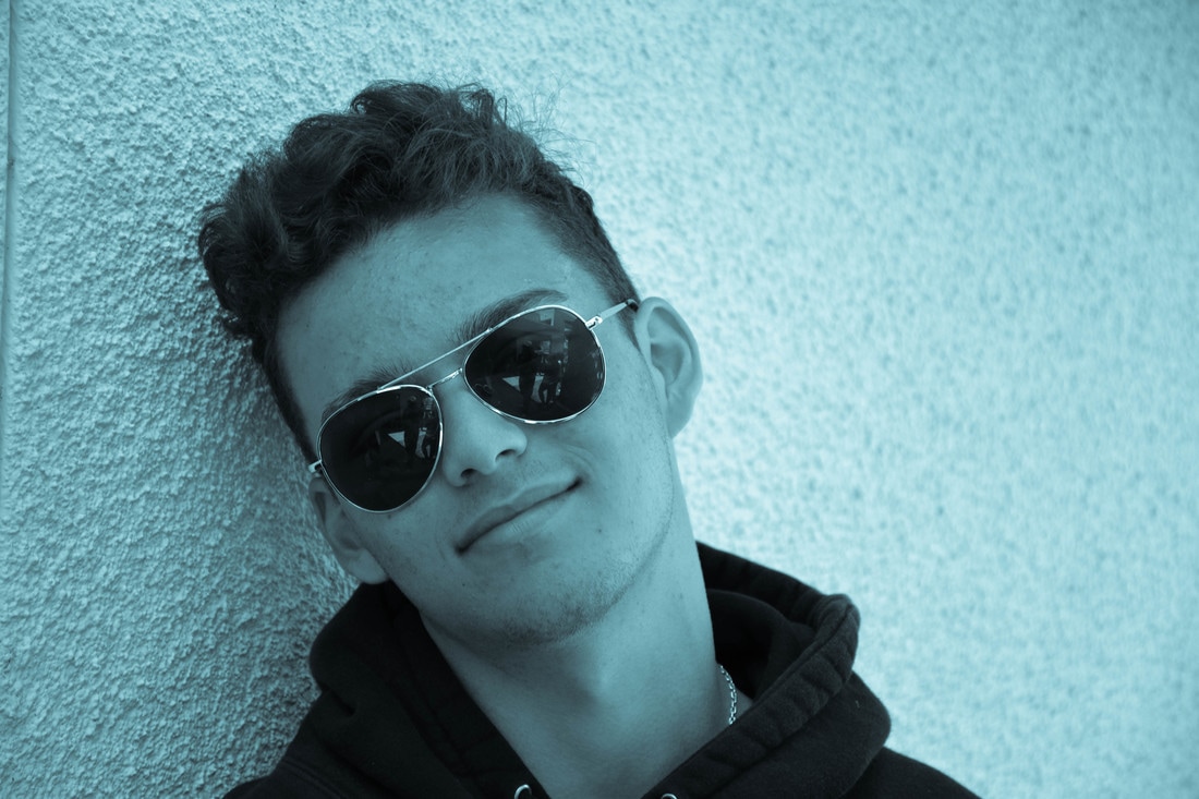
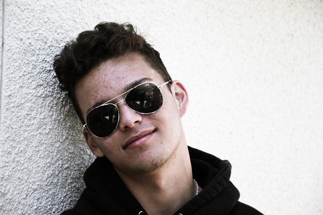
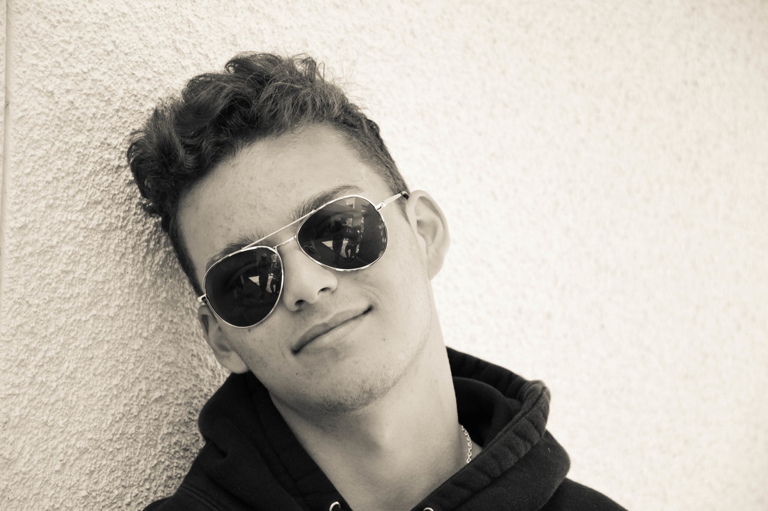
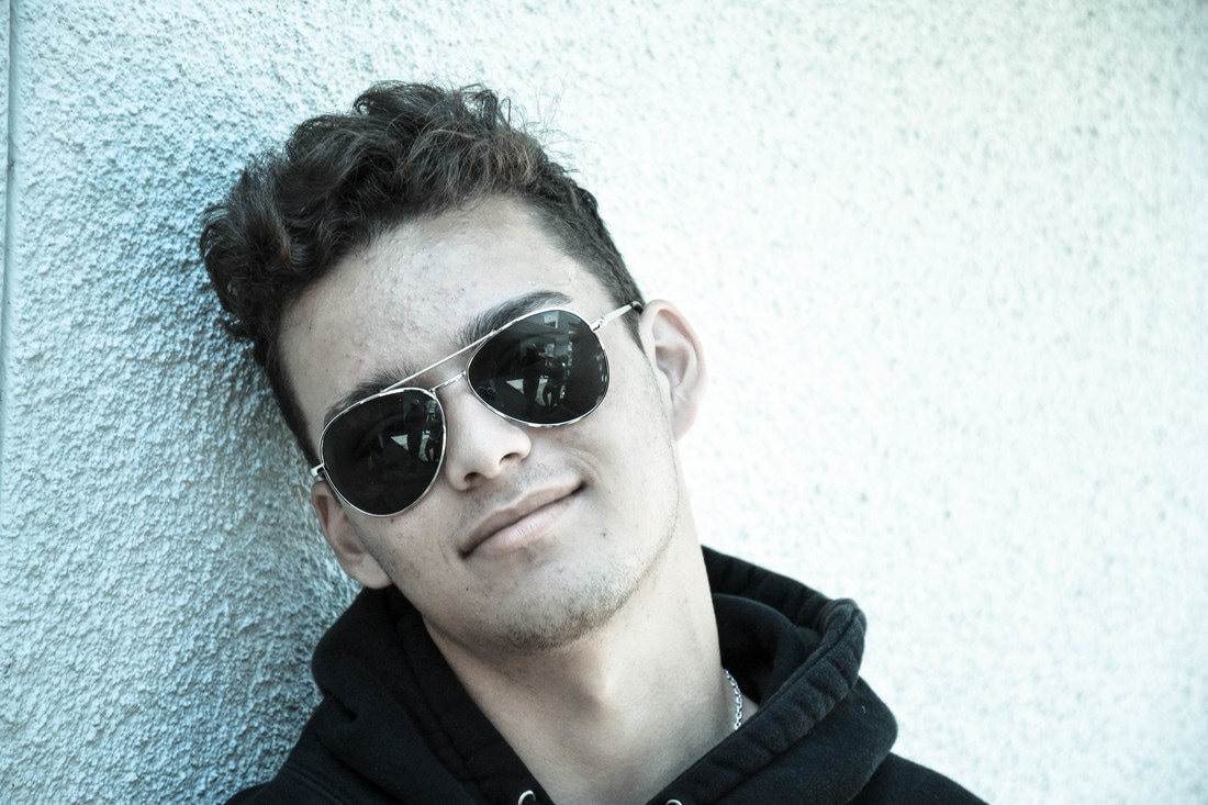
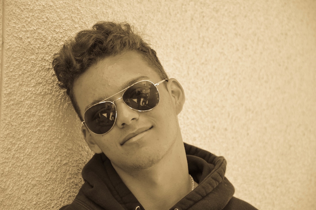
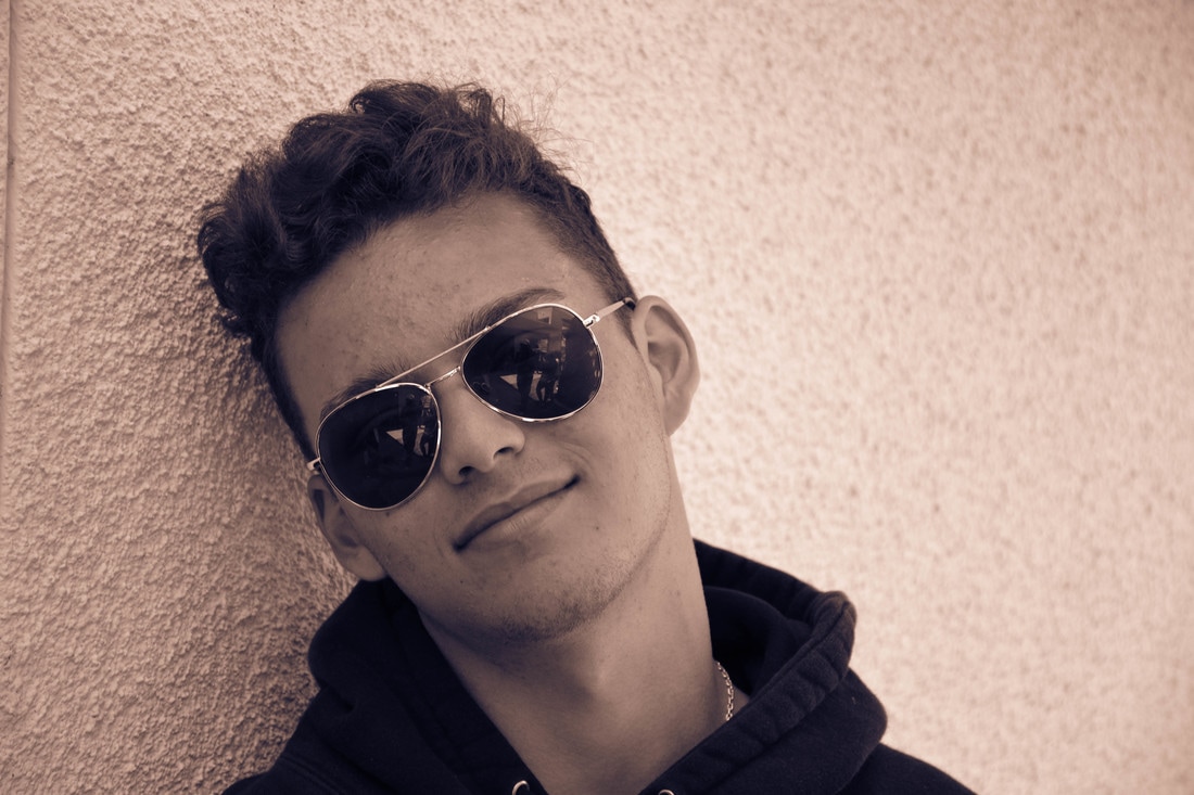
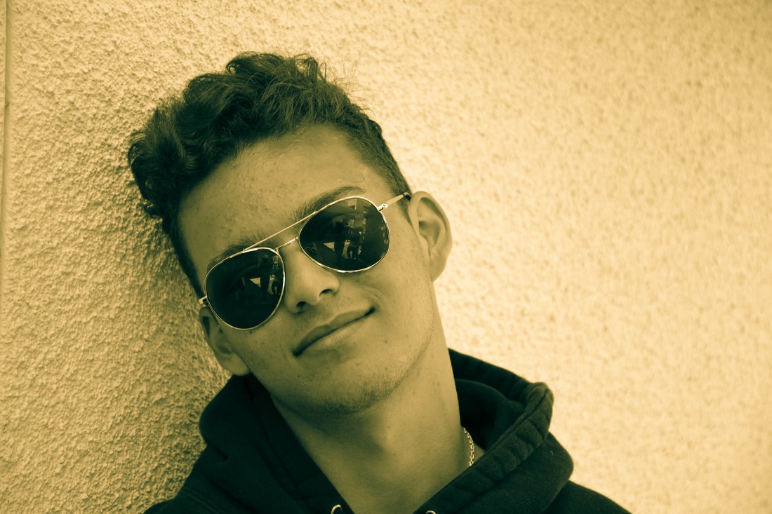
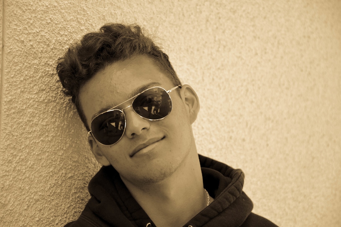
 For this project I chose Rolling Stone magazine because it's involves heavily in music and acting entertainment and I've always been interested in film and music. I added some text that will intrigue the reader like top hits, best albums, stuff like that. I didn't think too much on the font but I tried to make it something simple. I left the background color the same because I felt it looks more natural and it looks better with the text. The setup was a strobe light with a grey background in class. I stood in front of the background not knowing what to do in terms of posing. A strobe light is a device that emits a very bright, controlled flash. There was another type of tool to light up the picture, the modeling light and its a long "light saber" like thing that also could be controlled and it has color. A soft box was also used, its to be placed on the strobe to soften the light to prevent hard shadows. Since only one strobe is used a reflector was used to reflect light to the other side of me. To test the brightness of the light a grey card was used to test the brightness, if the grey on the card is too bright or too dark there light needs to be adjusted. Now there is one more important tool, the radio trigger system, this is what ties everything together. It connects the camera and strobe to that the shutter and flash go off at the same time.
0 Comments
David Hockney, born July 9th 1937, Bradford New England is a painter and photographer. His work in my opinion is similar to Picasso because it relates to cubism, but that's my opinion. His work actually falls under the pop art and modern art categories. He has a very unique style of art, it's very simple very modern. I tried to simulate his style of art specifically the photo collage as best as I could and I think I did well. It was not the easiest thing to get right it is a process. I took photos of the same scene only different angles and positions and literally threw them all together in photoshop. It could be a challenge to line up everything well enough for the viewer to know what they are looking at and not just a random mess. The thing I liked about doing this is it's not supposed to look organized because that isn't the style or at least not the style I was going for, just a little disorganized enough to make it noticeable that it's not one picture. It' all about finding that happy middle. 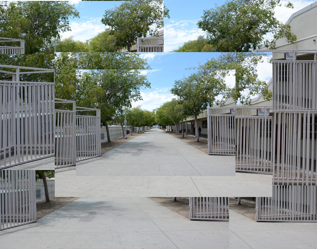 Leading Line 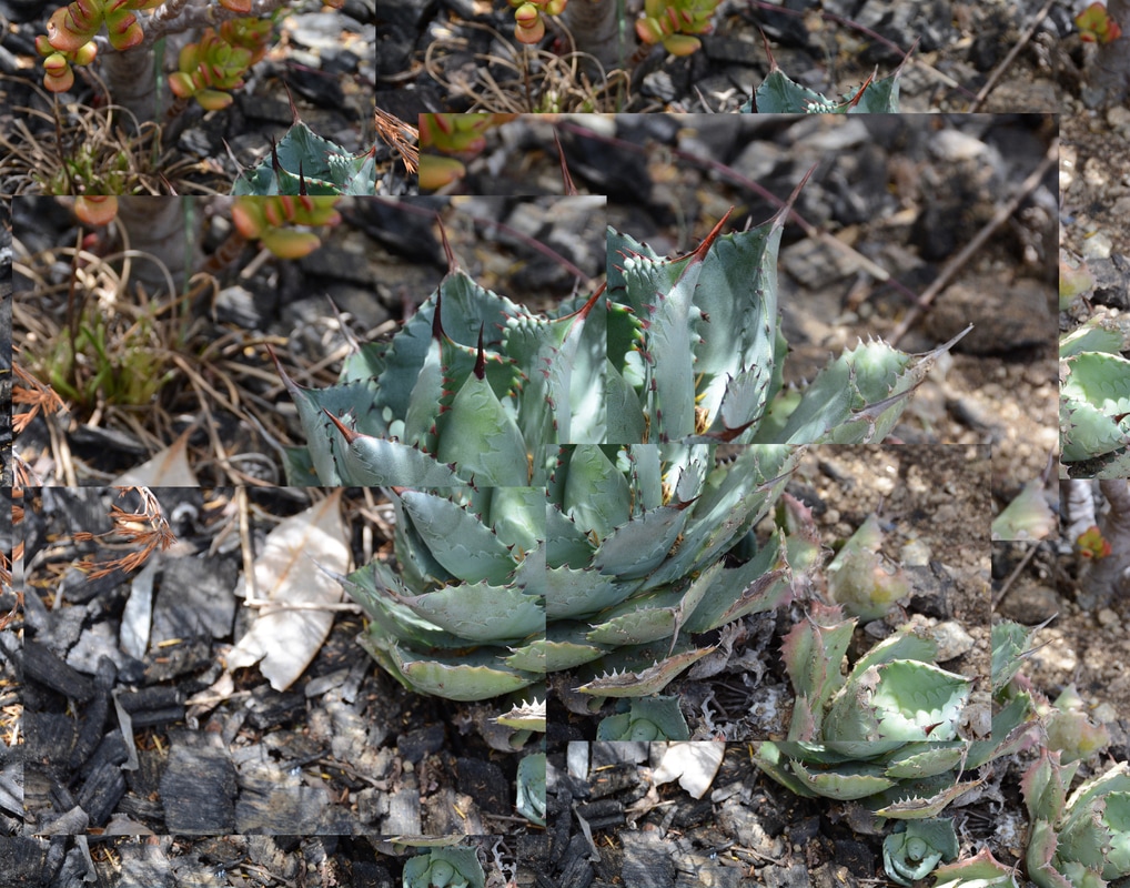 Crop  Aperture: f/5.6 ISO: 400 Shutter Speed: 1/80 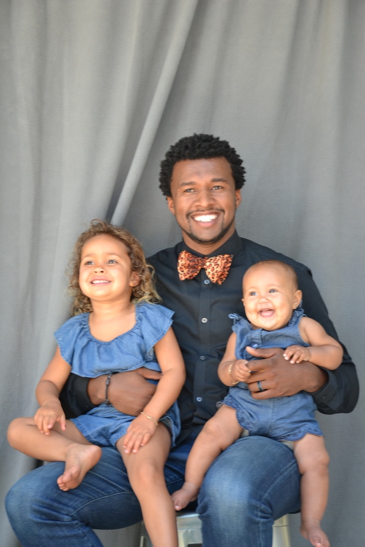 Aperture: f/5.6 ISO: 400 Shutter Speed: 1/80 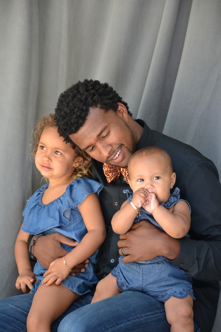 Aperture: f/5.6 ISO: 400 Shutter Speed: 1/100 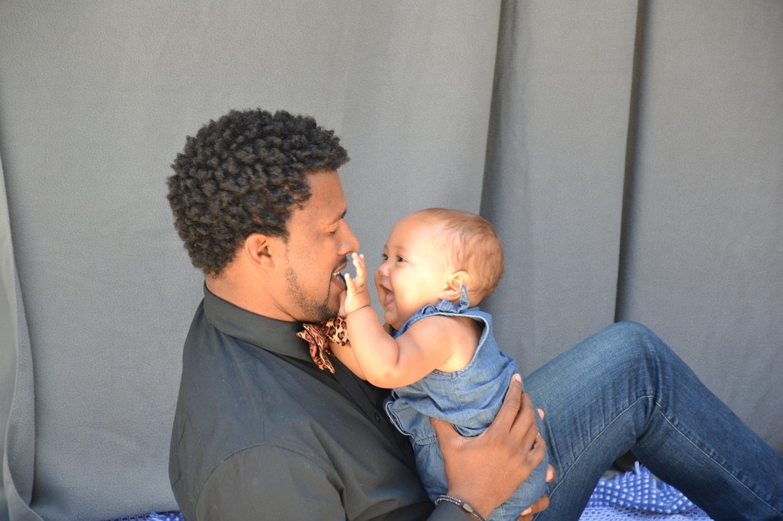 Aperture: f/5.6 ISO: 400 Shutter Speed: 1/80 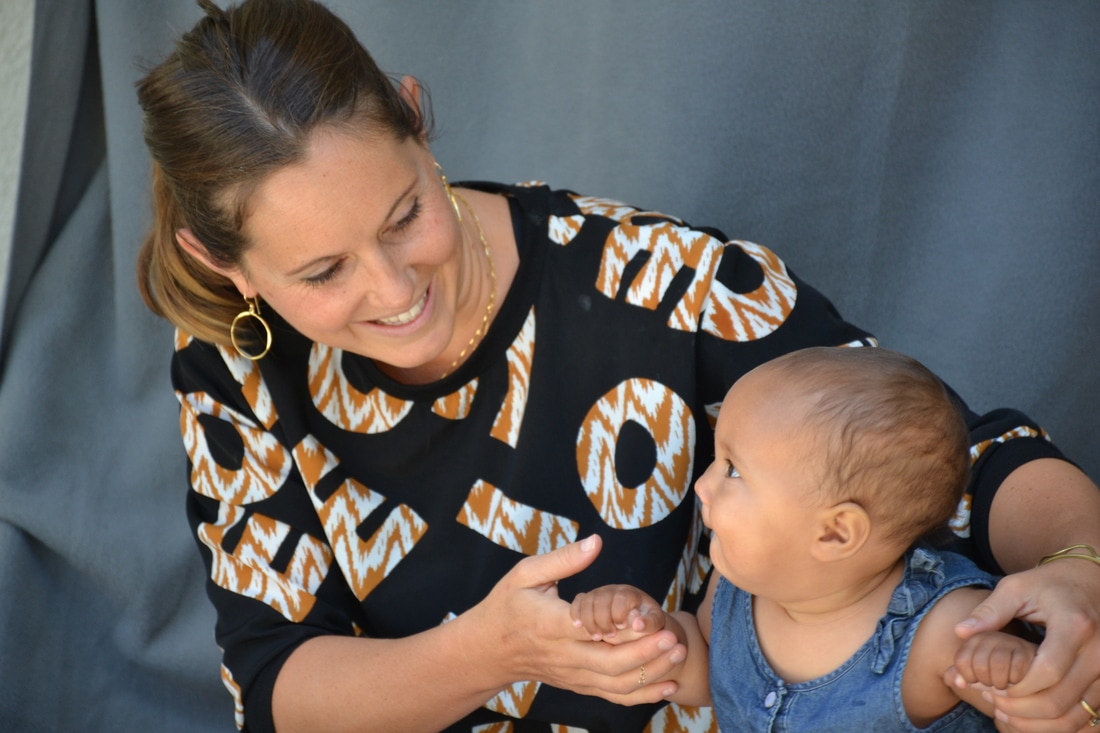 Aperture: f/5.6 ISO: 400 Shutter Speed: 1/125 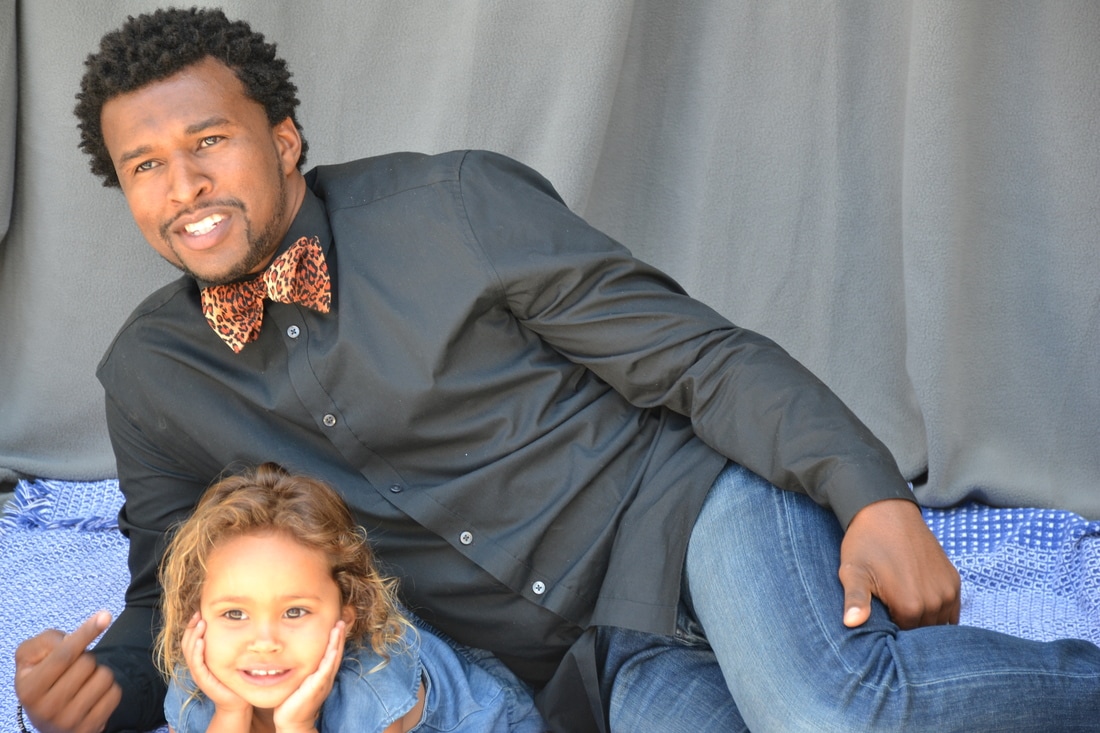 Aperture: f/5.6 ISO: 400 Shutter Speed: 1/160 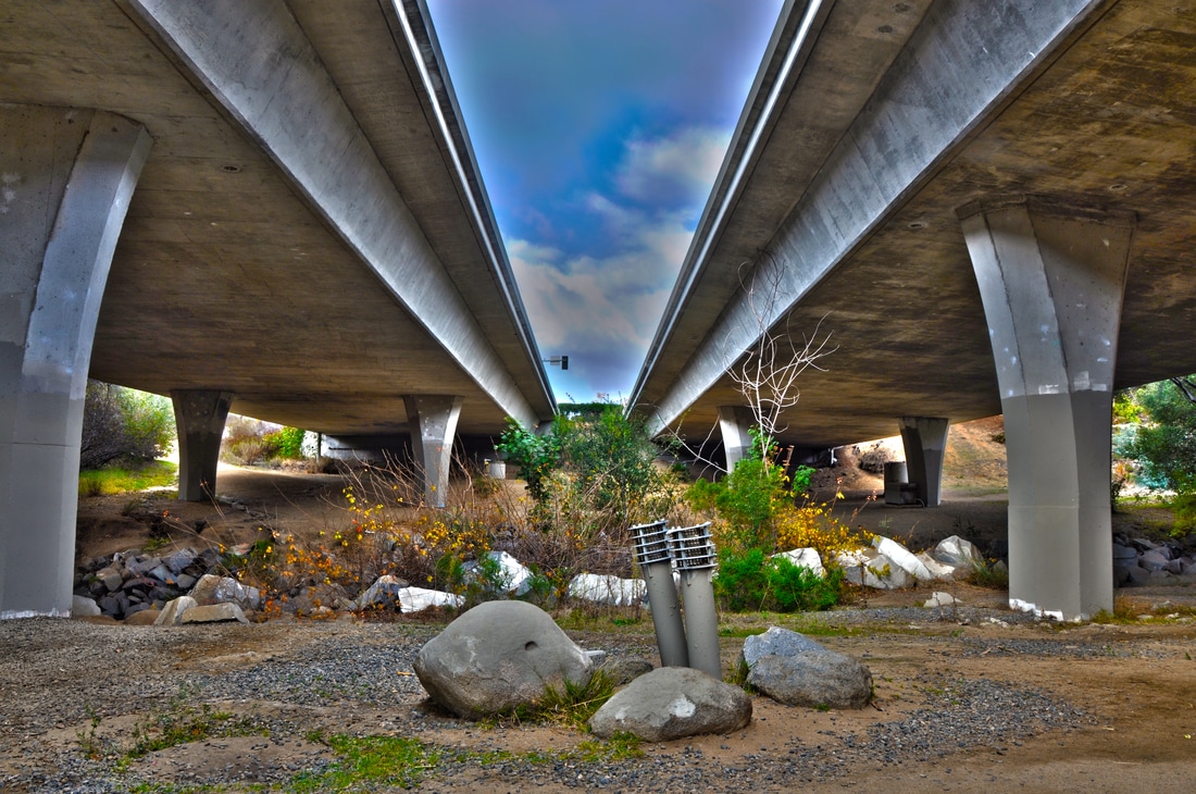 I am very proud of this piece; the title of this piece is A Different Perspective. I chose this title because you can find beauty in any and all perspectives. I took this image was taken on a pathway at Buena Vista Park when I came across a bridge. I noticed that it would make a great photo that I could use for the compositional rule of symmetry. I used a Nikon D5300 with a 18-140mm lens. This photo is an HDR photo that I made in Photoshop using 5 different images of the same scene but different exposures. I think this photo belongs in the color division because you can see the colors pop out, the dark blue sky really brings out the lightness of the bridge, the green in the plants and even the dirt has a nice brown color. The photo was printed on an Epson Glossy Photo Paper with the Epson P800 Digital Printer.
|
AuthorI'm a go with the flow type of person and very friendly, also extremely talkative. Archives
June 2017
Categories |
 RSS Feed
